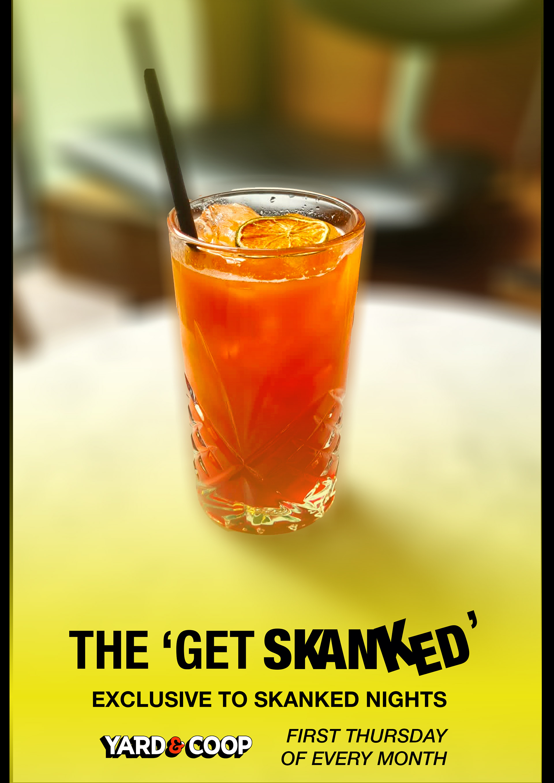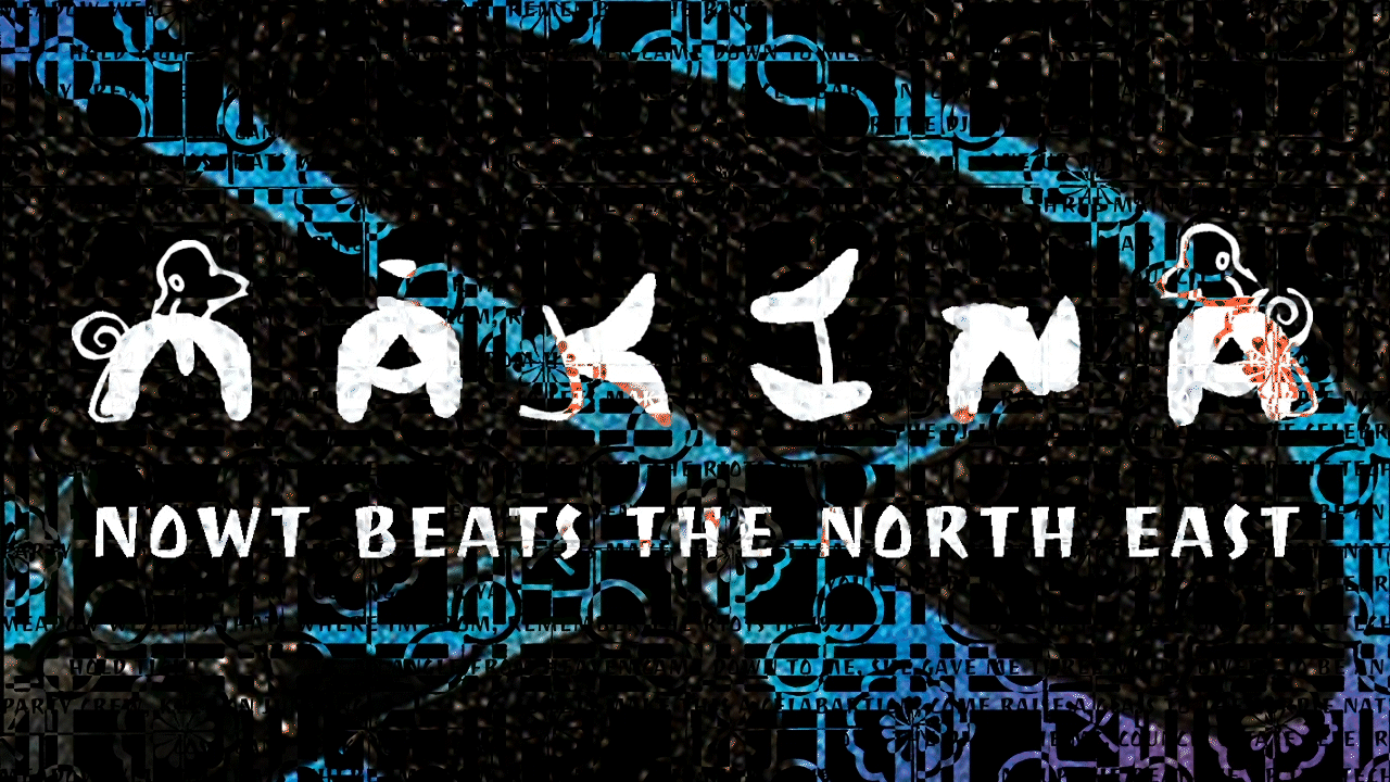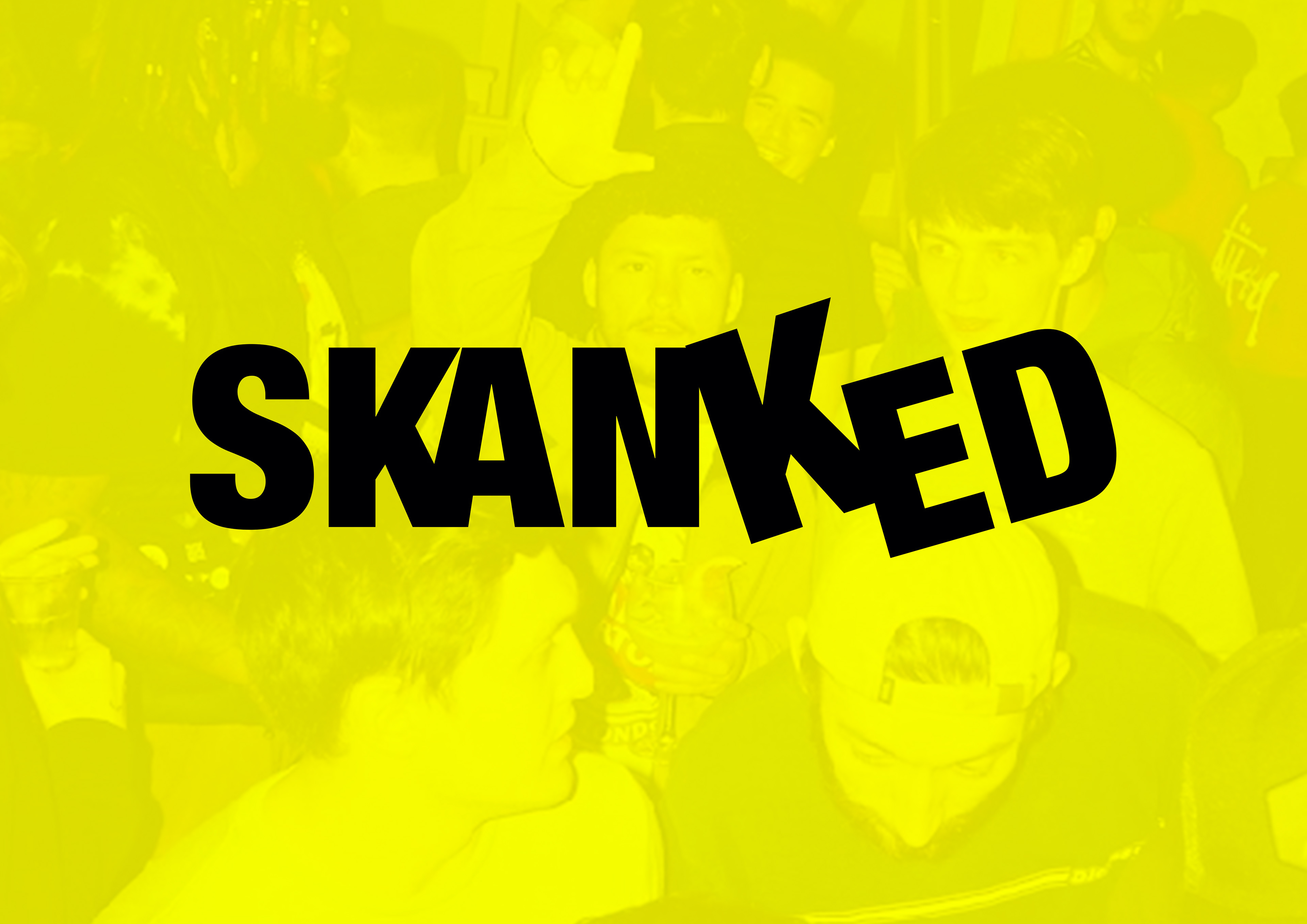
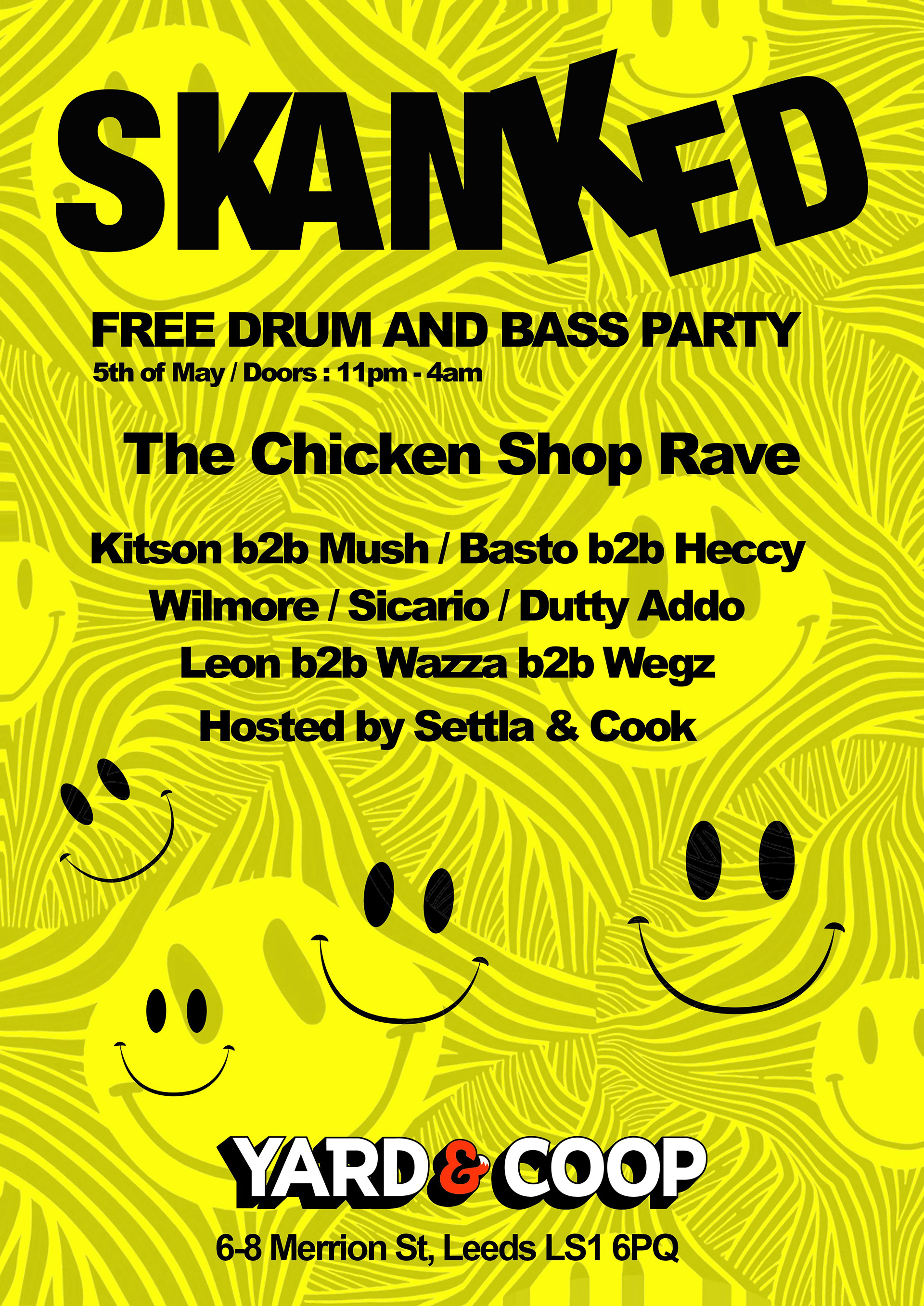
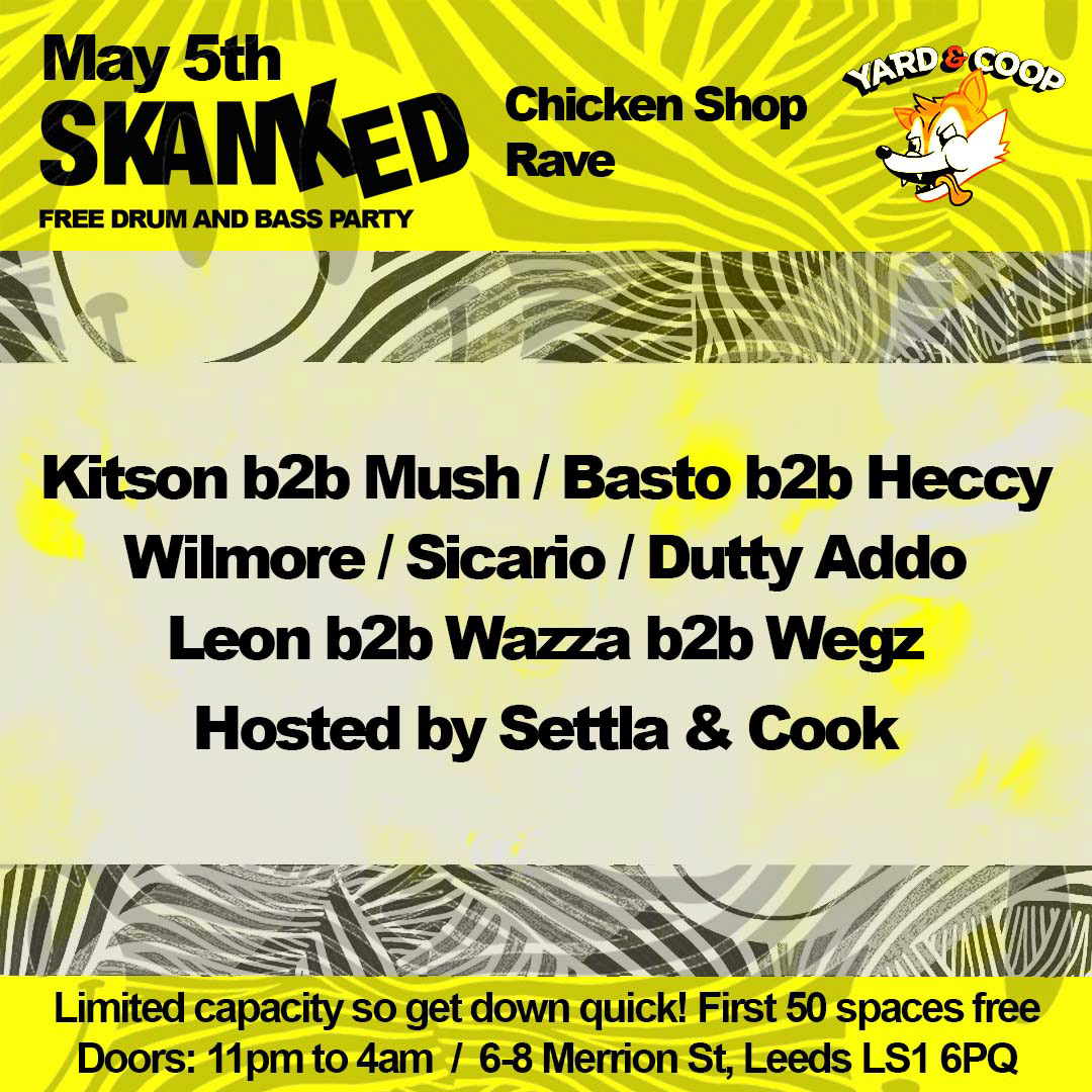
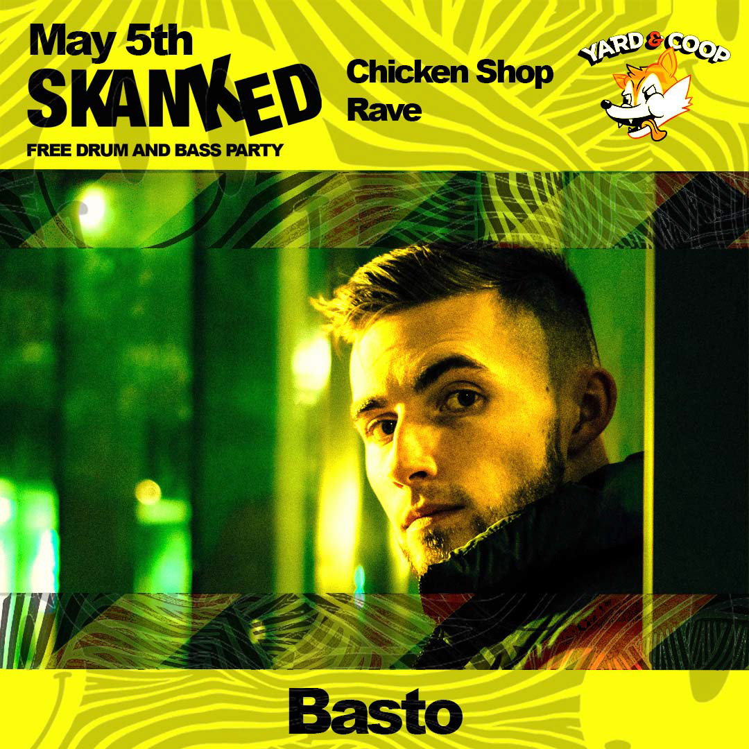
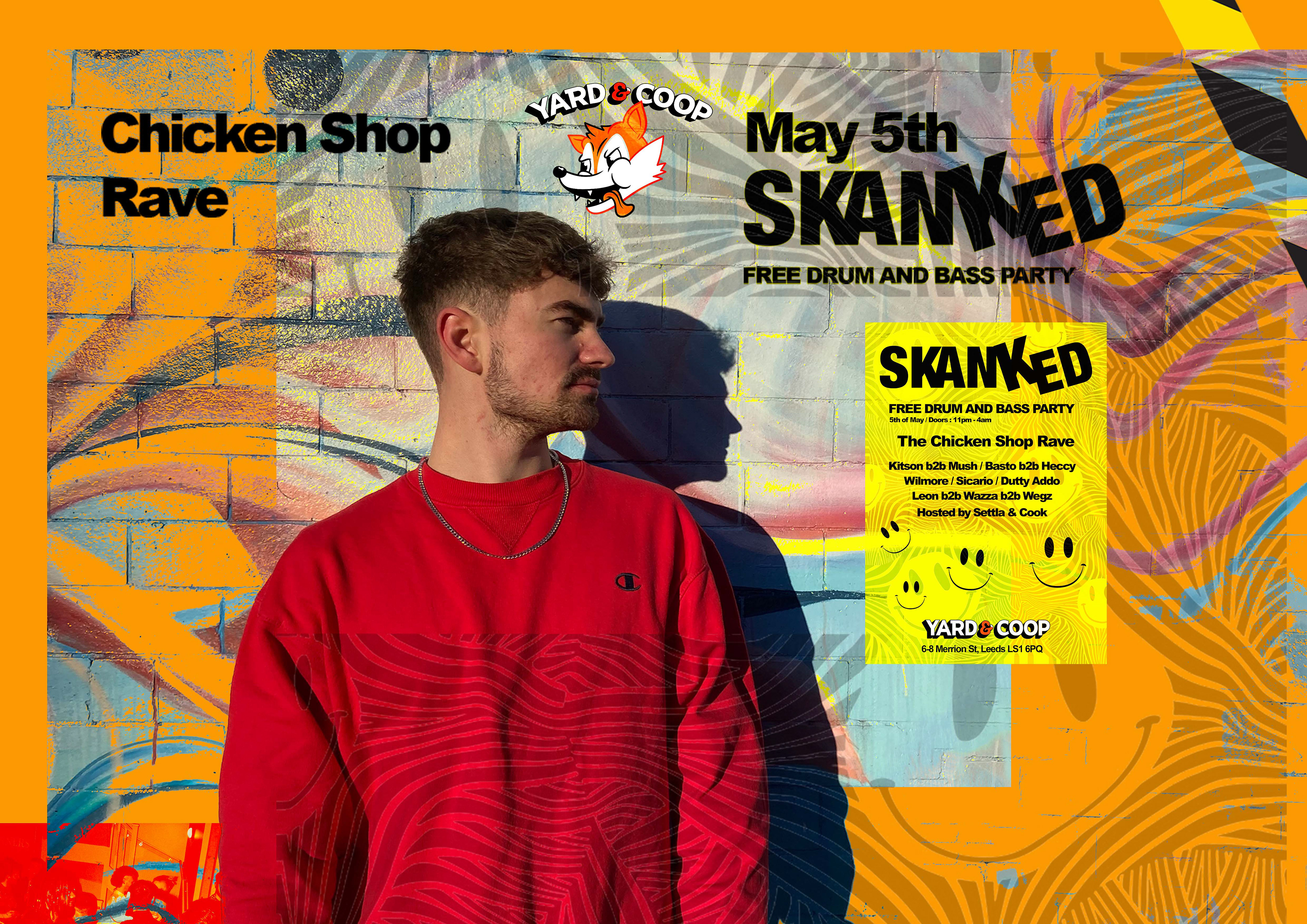
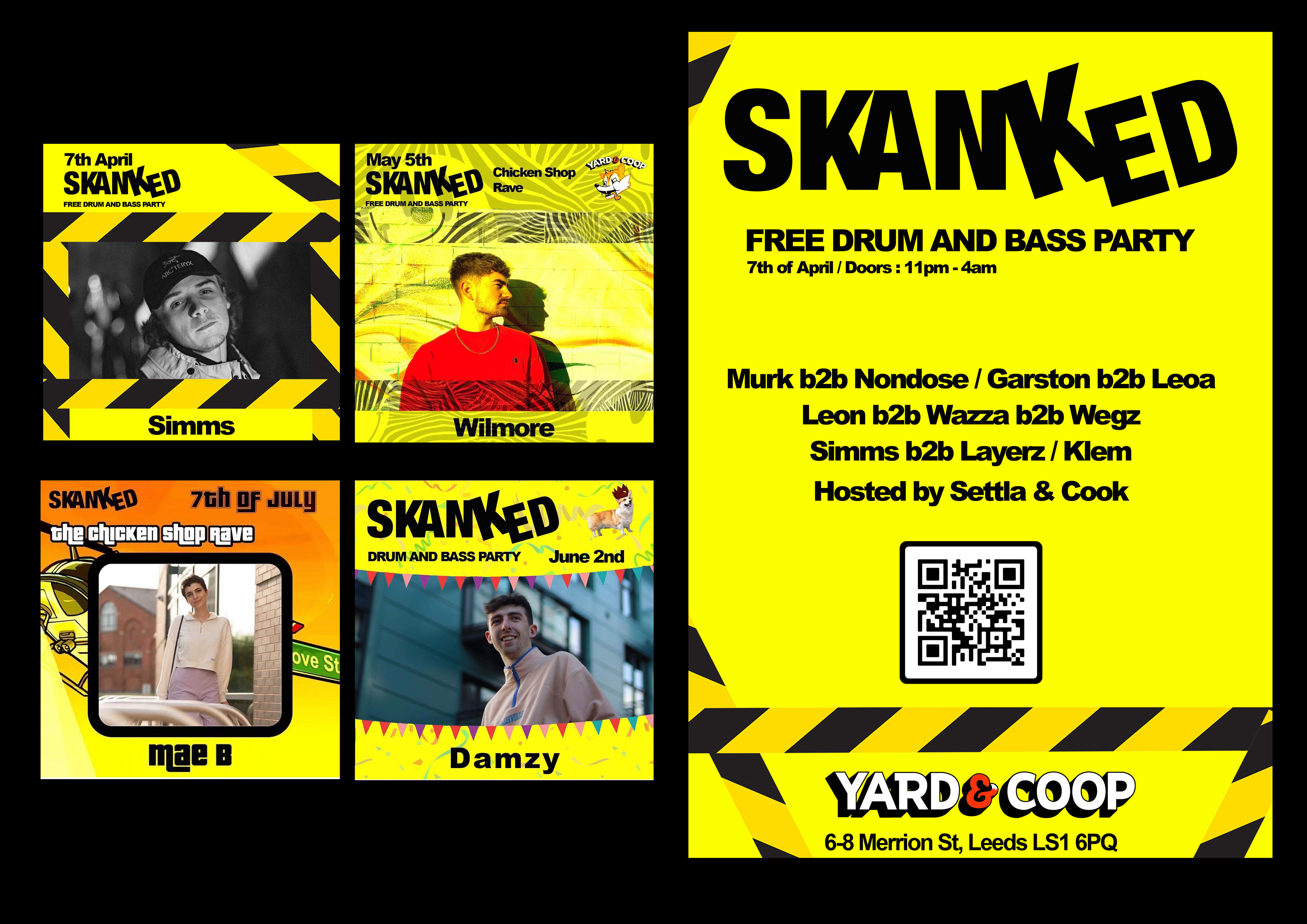
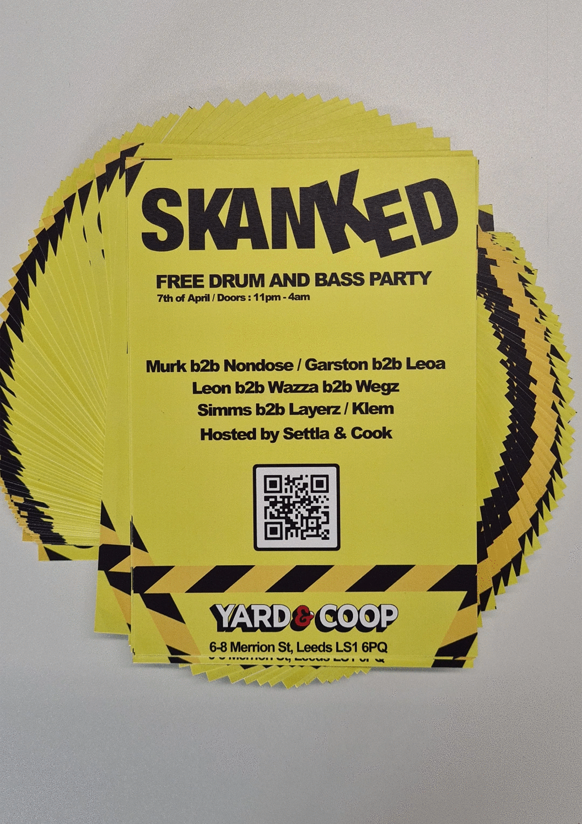
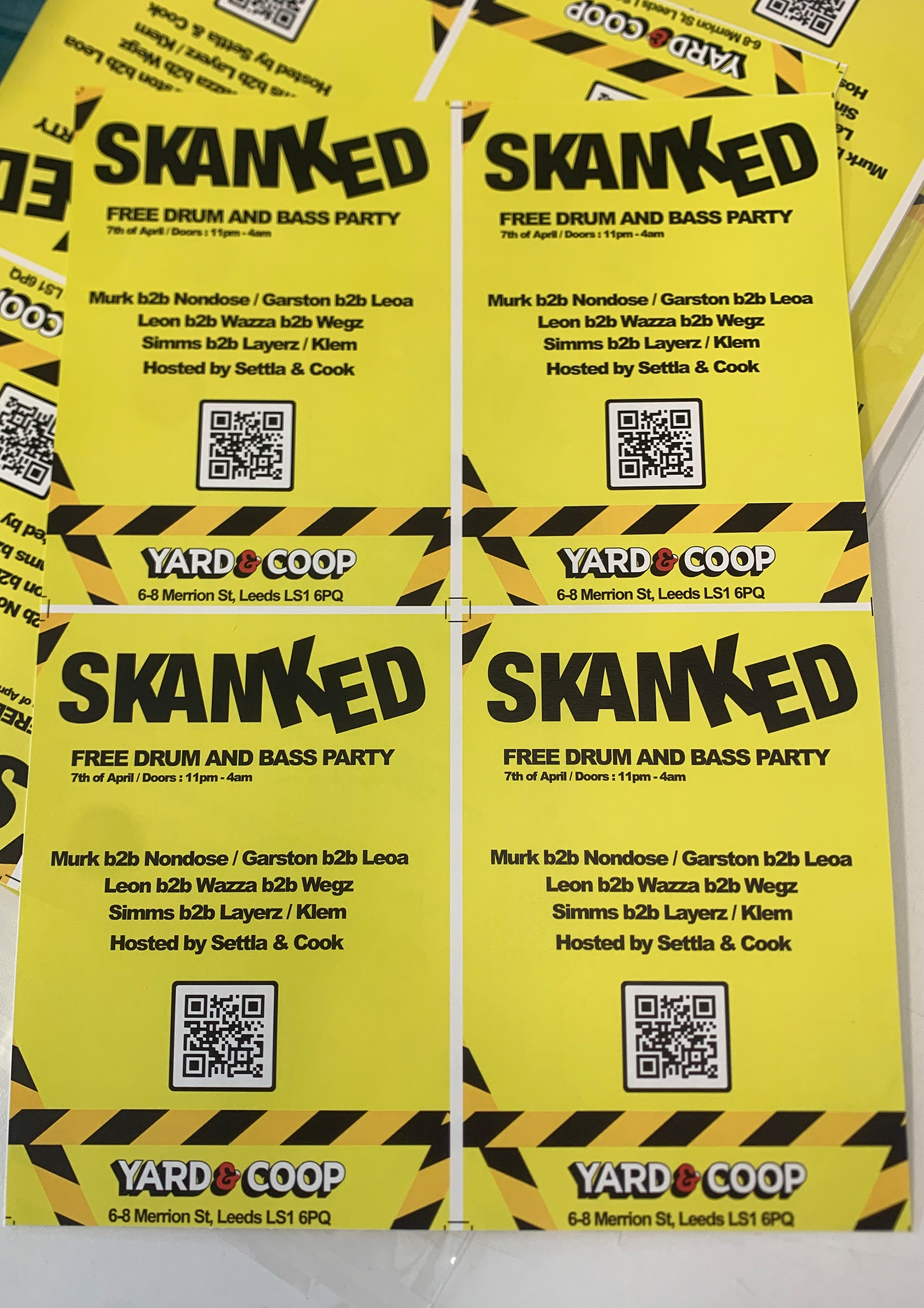
I kept the logo design bold and memorable as instructed while I added a slight letter tilt to reflect the dance “skanking” associated with the drum and bass culture the brand represented. I was further influenced by the TV show “Brainiac” to select key colours as it was a core memory from my childhood, which meant it matched the “memorable” status. I kept this consistent throughout all the graphics as I found it targeted the age demographic in question well.

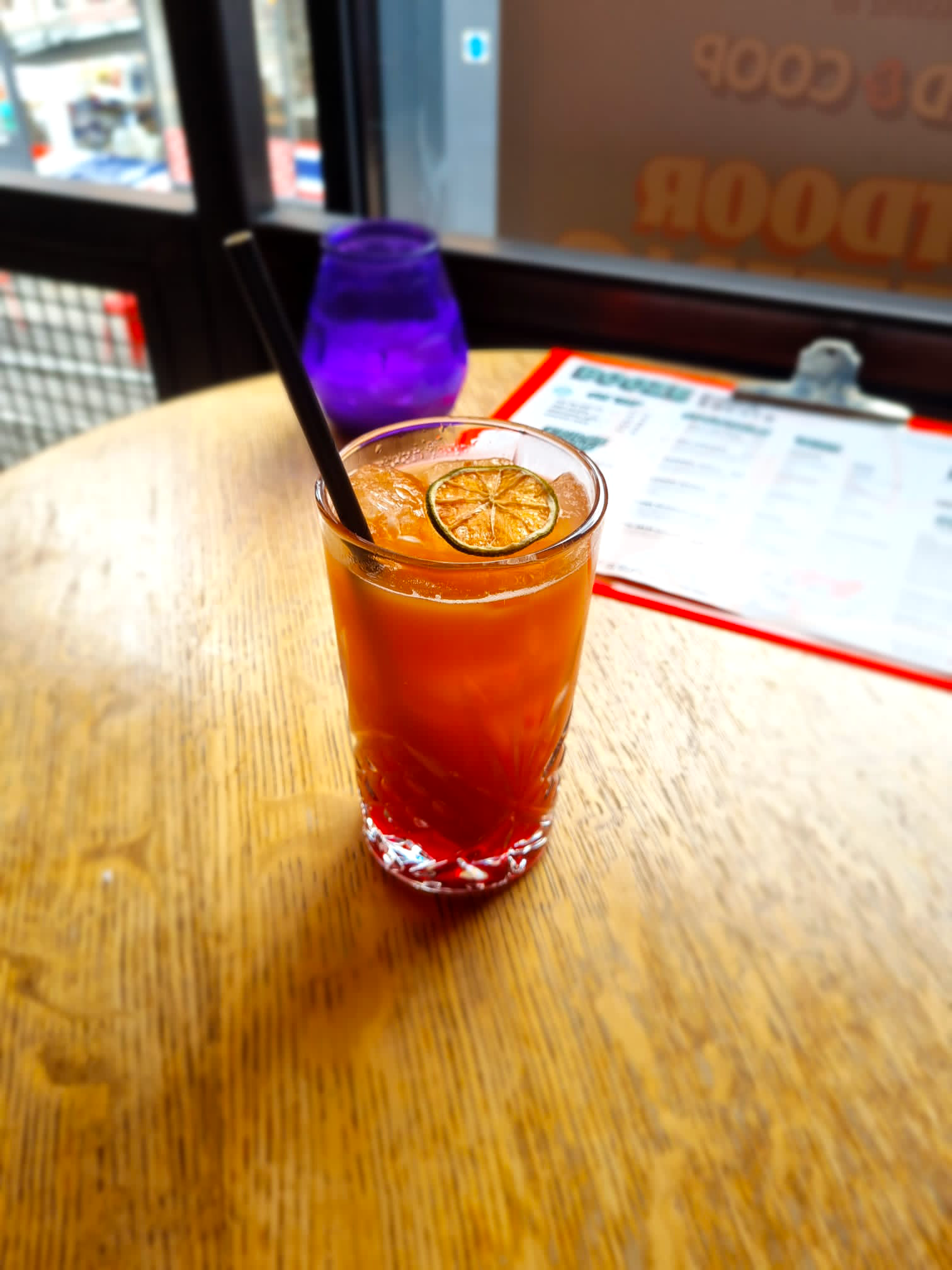
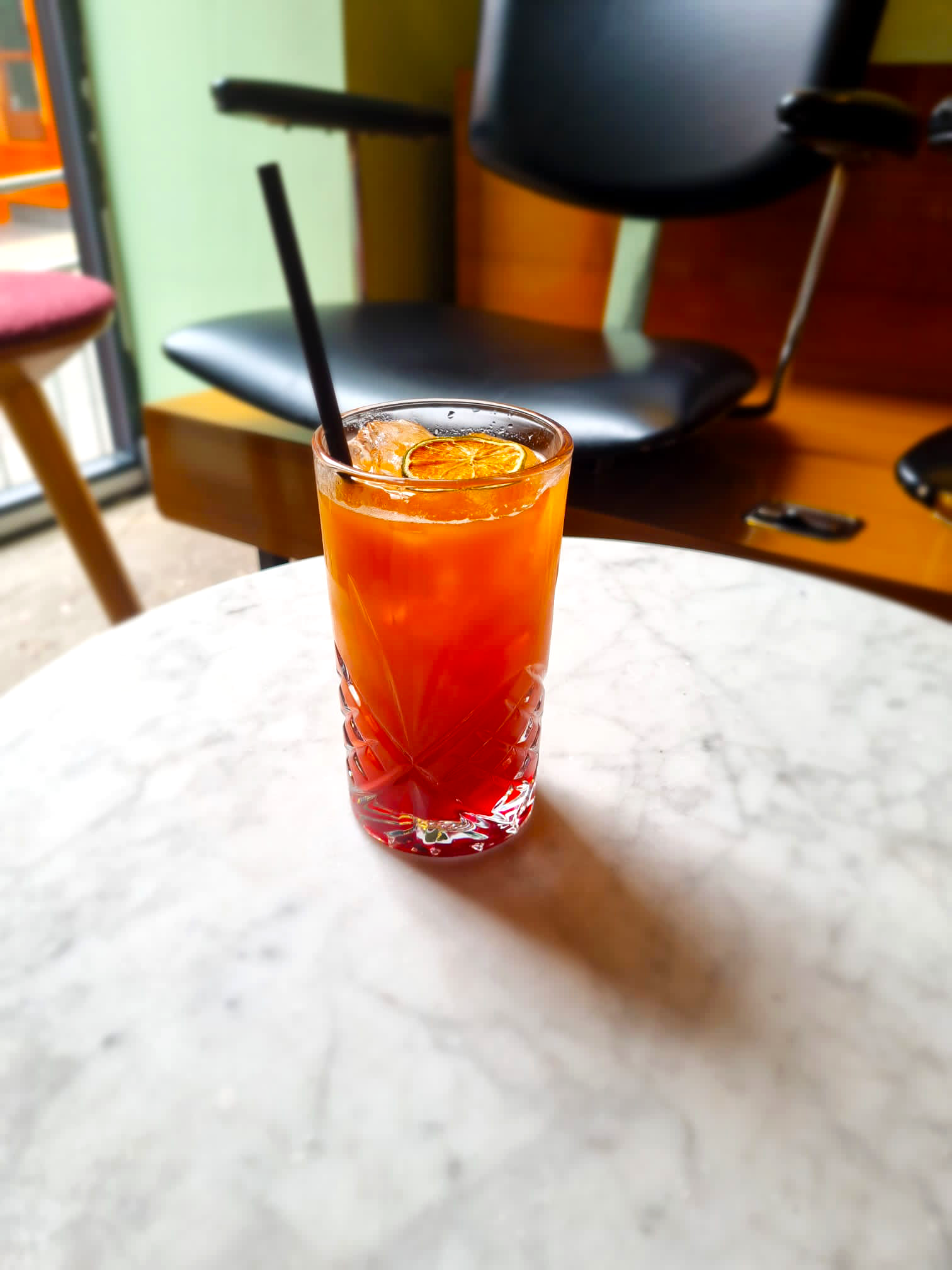
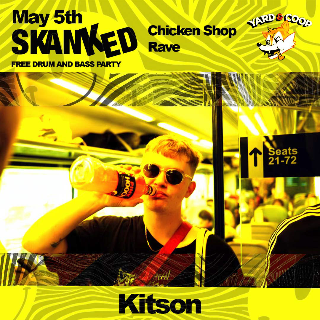
while working with skanked I helped with there marketing, below Is an example of a campaign I created and designed for them to help increase bar sales at their events. For this I worked with the venue to create a skanked cocktail which not only increased bar sales but added to the experience of attending a skanked event creating a memorable feature which makes the brand stand out compared to other events brands.